Slightly bulky and heavy design No free games included |
Nokia has taken its time getting into the 8 megapixel camera market and this, their N86 is the entry. It has a lot of catching up to do and the big questions are – will this one be worth the price? And will it have enough features to make you want to buy it? Take a look, here’s my opinion.
Form Factor
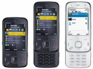
Nokia’s designs tend to be rather generic these days. The N86 doesn’t deviate from that too much. But the company is going to have to try damn hard to beat the likes the super slim ultra Touch. The N86 is a slightly bulky and quite a weighty device. The Indigo Black is definitely the way to go if you still want to buy the handset. The 2.6-inch AMOLED display is crisp and colors look really good on the same. The button system under it is well organized with a five way nav-pad and a dedicated menu key like with the N97. It has a micro USB port for charging and connectivity on top beside a 3.5mm earphone socket.
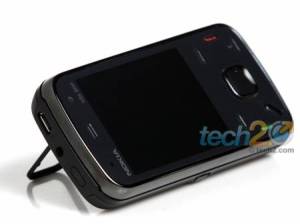
A lens cover can be slid down to reveal the camera. It has dual LEDs for the flash. Around the camera is a small kick stand that can also be used to activate certain specific features when opened. It props up the handset rather neatly.
Features and Performance
Interface
I don’t need to go into detail about the UI. The n86 runs on a Symbian OS (v9.3) with a S60 UI. That coupled with an ARM 11 434 MHz processor makes it a speedy handset even while multitasking. It has an accelerometer that smoothly changes screen orientation irrespective of what feature is running. It does tend to be a little too sensitive sometimes though. The only time the display doesn’t change is when you’re viewing Nokia Maps and this I found a little strange. The digital watch that shows up as the screen saver gives the handset a rather edgy look.


This was really great to read. Thank you!
awesome