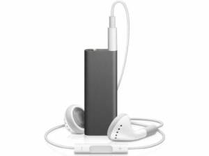
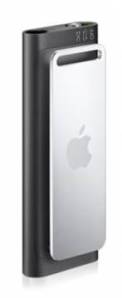
The third generation iPod Shuffle (4 GB, Rs. 4,900) has arrived in our labs after a strangely quiet global launch that involved absolutely none of the usual hype and hoopla that Apple usually generates around its products. Nevertheless, it’s one of the most outrageously designed products we’ve comeacross in a long time.
We’re surprised that there’s a new shuffle, partly because the previous generation wasn’t that old, and partly because we didn’t expect there’d be much to change or improve. So what’s the new one got to offer? The answer is still minimalism, with not much capacity and no screen or menu-based navigation for those who just want a cheap, simple music player. But while that core identity is the same with this new model, a lot of the rules have been rewritten!
Looks and Features
If you thought the shuffle was already small, think again! The new one is a bit longer but a lot slimmer, making it about the size of a pencil eraser or a small Bluetooth headset. Its weight is nearly unnoticeable when clipped onto your clothes or bag strap. It looks absolutely clean and smooth, without a single bump, ridge or mark on the front and only the stainless steel clip on the back. The upper surface is where you find the earphones/USB socket and a tiny power/mode switch.
More minimalism is seen in the lack of color options: while the previous generation could be had in bright, peppy pinks and greens, this one is available only in sober silver or grey. The earphones’ cord is about 28 cm shorter than usual which totally eliminates bunched up wire if you clip the device to your jeans pocket or shirt hem, but is uncomfortably short if you prefer holding it in your hand while walking.
The new shuffle’s biggest talking point and the boldest move so far in its history of culling common features is the complete lack of controls on the device itself. The ring of buttons is gone, and you have to use the inline controls on the earphones’ cord for all track navigation and volume changes. It takes a while to get used to the idea, but considering how small the shuffle is in the first place, it makes sense to tuck it away while keeping the controls within reach.
Related

